Get to know the iluminr Threat Dashboard
Everything you need to know about the iluminr threat dashboard
The iluminr threat dashboard provides a near-real-time view of natural disaster, physical security, infectious disease, utility and travel and transport threats around the world.
Each threat has an identifiable threat icon, colour coded by current severity level, from 'be aware' through to 'severe', to help you determine the relative threat level posed to your organisation.
Where can I access the iluminr Threat Dashboard?
- Visit the iluminr website for your region
- Login using your iluminr username and password.
- Click the Threats tab.
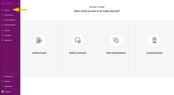
What are the components of the iluminr Threat Dashboard?
Threat Display
In the threats menu, under the main navigation menu, there is a threat display filter. This specifies the number of threat types currently being displayed, in comparison to the total number of available threat types.

Filter Threat Display
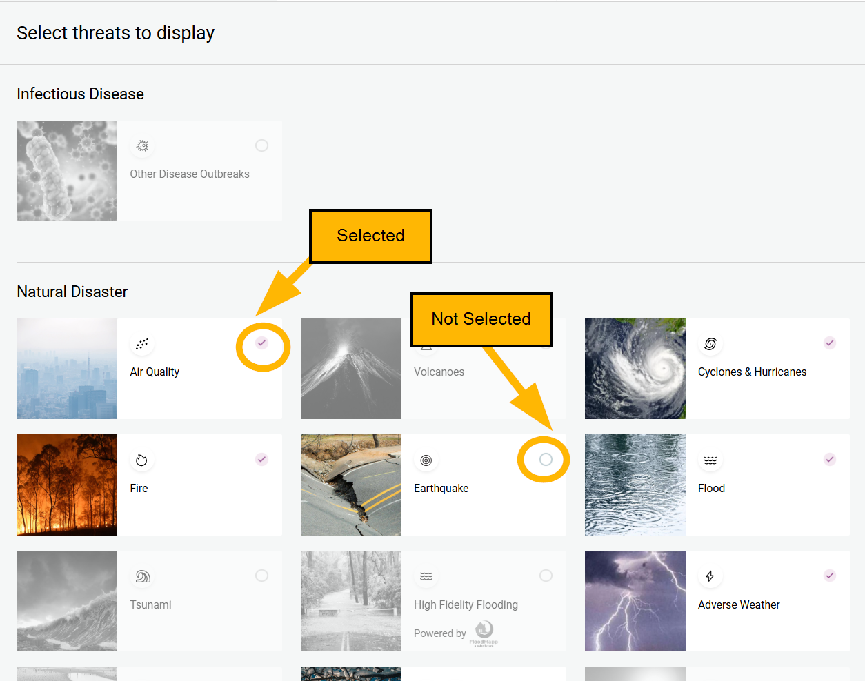
Click on the menu arrow, to open the current threat type display settings. Use this threat display filter to focus on specific threat type(s).

Selected threat types will have a tick, and unselected threat types will have a clear radio button. The map will populate with threat icons for the threat types selected.
Site Display
In the threats menu, the second option is the site display filter. This specifies the number of sites currently being displayed, in comparison to the total number of sites you have added to iluminr.

Filter Site Display
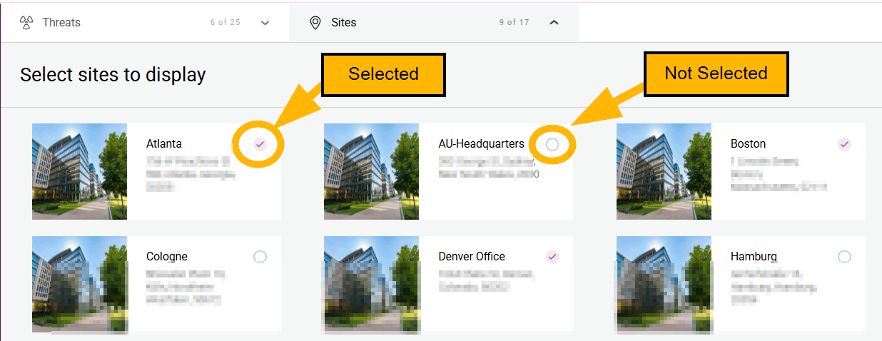
Click on the menu arrow, to open the current site display settings. Use this site display filter to focus on specific site(s).

Selected sites will have a tick, and unselected sites will have a clear radio button. The map will populate with Site Icons for the threat types selected.
To select all threat types click the Display All radio icon, located on the right-hand side of the screen.

All Threat & My Threats View
Learn about the two iluminr map views (All Threats and My Threats) at Get to know the iluminr Threat Map Views.
Threat Icons
On the iluminr Threat Dashboard, each threat icon has an identifiable symbol, colour coded by current severity level to help you determine the relative threat level posed to your organisation. Each threat can be hovered over for summary details or clicked on to activate a more detailed side panel.
Symbols
On the iluminr Threat Dashboard, each threat has an identifiable icon.
Tables can't be imported directly. Please insert an image of your table which can be found here.
|
Category Types |
Categories |
|
Natural Disasters |
|
|
Physical Security |
|
|
Infectious Disease |
|
|
Utilities |
|
|
Travel and Transport |
|
Colour Code
The colour code indicates the threat severity from 'be aware' through to 'severe'.

Site Icon
The selected sites will be identified on the map with a site icon.

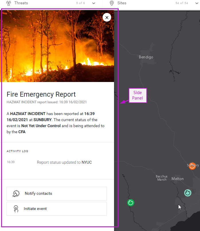
Side Panel
Hover over a threat icon for summary details.
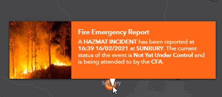
If a threat meets your threshold requirements, you can select the threat to activate the side panel and see which sites are impacted.
Related Articles:
Need more assistance? Submit a support ticket